Showing posts with label valuation. Show all posts

Tuesday, January 07, 2025

Caution: We Are Entering A "Prove It" Market


  • In my recently released book, The HIdden Power of Rising Dividends,(available at Amazon) I make the case that dividend growth is highly correlated with price growth for many stocks and indices.
  • In the book, I suggest that dividend growth alone is highly correlated with price growth for 25-35% of S&P 500 stocks. For an additional 50% of stocks, dividend growth is the most important indicator of value, but the correlation scores rise when we add some portion of sales and earnings growth, along with changes in interest rates.
  • The consensus view of many stock market prognosticators today is that stocks, now trading at 27 time operating earnings, are extremely overpriced and are due for a big correction.
  • My S&P 500 valuation model is telling a much more balanced story:


  • The above chart is what I call a Value Bar chart. The green bars show my model's annual predicted price of the S&P 500 going back to 2005. A quick look at the bar farthest to the right on the chart shows the model's current predicted price of the S&P 500. That figure is approximately 5,400. With the current price of the S&P 500 at around 6,000, the model is saying stocks are overvalued by about 10%. That, however, is before we factor in 2024 year end earnings and 2025 forward earnings.
  •  Before we take a deeper look at the current predicted price, let's look back over the years to see how the model has fared.
  • Simply speaking, if the red line (actual price) is above its corresponding Value Bar, we would say stocks are overvalued. If the the red line is lower that the Value Bar for the same year, we would say stocks are undervalued. For the last 20 years, the red line has stayed very close to the top of the Value Bars. A significant divergence is evident in only 2007, 2008,and 2022. In almost all other years, the Value Bars and actual prices of the S&P 500 are very close.
  • Stocks continued to climb heading into the beginning of the Great Recession in 2007. At some point during the year, the model would have issued an overvalued signal. The model clearly signaled the market was overvalued in 2008.
  • After the bear market of 2008 and 2009, the Value Bars stayed in fairly-valued or undervalued territory until the end of 2021, when they gave an overvalued reading. That signal correctly foresaw the selloff in 2022.
  • That brings us to the current modest overvaluation. Plugging in Wall Street's current estimates of sales, earnings, dividends, and interest rates give us a figure of 6,500. 
  • We are now entering what I call a "Prove It" market. This means, tech stocks, where the majority of the growth is coming from, must "Prove It" that they can continue with mid 20% sales and earnings growth. If they do, we should have another pretty good year. If not . . . .
  •          
If any of you would like to discuss this article privately, please email me at info@gregdonaldson.com.


Wednesday, October 23, 2024

Using Simple Mathematical Calculations to Value Coke vs. PepsiCo

 1. In my recently released book, The Hidden Power of Rising Dividends, I described my 40-year journey into finding methods of valuing stocks.

2. My journey of valuation discovery was always about finding methods that worked, not just focusing on dividend investing, although for many companies, dividends are the best indicator.

3. Over the next few months, I am going to do a series of valuation comparisons of great companies of our country and the world. These comparisons will describe the various methods I have found to be helpful. The first two are Coke and Pepsi.

4. Coke and Pepsi are powerful brands that have won over our taste buds, grocery shelves, and portfolios. Most people are in one camp or the other, but these two companies are very similar in many ways. My blindfolded taste test can't tell them apart.

5. Since they are so dominant and so similar in their products and marketing, I have found that most people assume they are almost always efficiently priced and valued at about the same level. In this first look at the tools I have learned to use, a surprise may be in store for you.


 In valuing Coke and Pepsi, I am using a multi-stage correlation model. This model computes a correlation score, called R2, for eight different fundamental indicators for each company, such as earnings, dividends, sales, profit margin, GDP, etc., compared to changes in the company's annual stock prices. With both companies, the correlation, R2, between their annual dividends and stock prices is above 90%, and overrides the need to include any of the other fundamentals. Very simply, this means that over the last 15 years, the annual changes in the dividends for each company were able to explain 90% of the annual changes in its price. 

Next, look at each chart and note that stock prices are on the vertical axis and dividends per share are on the horizontal axis. The red line is the actual annual price over the last 15 years and the green line is the predicted price using the correlation formula. Here is where the model begins to talk. While these two companies are very similar in what they do, they are not similar in prospective valuation. PepsiCo's chart shows its current selling price of over $175.00 is well under its predicted price of $190.44. Coke's story is just the reverse. It is currently selling for over $68 per share, but its predicted price says it should sell for $63.74.

Remember, this analysis is pure math. It is not a deep analysis of each company's intrinsic value. This is just a statistically significant computation comparing the changes in each company's annual dividends with changes in their annual stock prices. Yet, with 90+% correlations for both companies, to ignore what the dividends are saying would be unwise. Indeed, these computations are saying Coke is over 15% more expensive than PepsiCo. A spread that wide would seem to favor PepsiCo at present. Next, however, we all know that the market always looks ahead. Next time I will share with you howe we can adjust the current valuations for a look into the future. In the meantime, let's just see how the the two stocks perform over the next few months.   

Thursday, August 08, 2024

Don't Fret, It's Picks and Shovels Time in the AI Gold Rush

  • Fears of a sharp economic slowdown, and worldwide heavy selling of stocks have hit U.S. stocks in recent weeks.
  • Recent economic releases have shown that unemployment is rising, home sales are slowing, manufacturing production is softening, and wage gains are flattening out. These weaker economic data points have caused fears of a recession and a move out of stocks and into bonds. 
  • This flight to safety has seen 10-year U.S. Treasuries to fall from near 4.75% a few months ago to 3.75% on Tuesday. The slowing economy fears have caused the S&P 500 to fall by nearly 10%. 
  • The sell off in stocks and specifically in the tech stocks is hard to reconcile in the face of the solid second quarter earnings growth reports across almost all industry sectors, from AI leaders to banks and industrial companies.
  • Does this big sell off mean the AI gold rush is already over? Moreover, does it mean the bull market in non-tech stocks, which was signaled in recent weeks, is also only a head fake?  

It is important to remember that gold rushes are driven by forces other than “there’s gold in them thar hills.”  At times, reality sneaks in to play a role in the pricing. The reality in this case is investors have become worried that the tech stocks have come too far too fast, and they no longer offer value at their inflated prices. There is nothing new about that worry. It’s very realistic and has been around as long as the tech stocks have been. The techs are trading at about 30-35 times earnings and projected to have earnings growth of 15-25% over the next 3-5 years. In an earlier post, I stated that if the current earnings projections for the techs and the S&P 500 prove correct for year-end 2024 and 2025, the market will go higher. My valuation model still says 5800 is the best guess of the current fair value of the S&P 500.


It is necessary to square the recent week economic news and sharp sell offs in worldwide stocksand interest rates with corporate earnings that are being reported every day. All these data

are being collected in the same time frame, and history tells us that earnings and dividend growth

have more predictive power in the long run than do changes in GDP and interest rates.


In my judgment, the billions of dollars that corporate America is investing in AI have not had nearly

enough time to find gold. We are in the “picks and shovels,” or early stages of the gold rush where

the miners are assembling the people and tools, and identifying where to mine. In short, nowthe big winners are the chip companies that manufacture the AI chips. The products

and services that will be forthcoming in the years ahead are still concepts. Yet, when giant sums

of capital are being placed in the hands and minds of the smartest tech people in the world,

life-changing products and services are assured.    


I believe an AI gold rush is underway. AI gold will be found and lead to huge stock gains in many existing, as well as start-up companies. My calling it a gold rush is not a total disparagement. The operative questions are: How much gold is there to be found, and who will find it? Almost certainly, too much money will ultimately join the gold rush, but it is far too early to declare AI dead. That being the case, the huge selloff in tech stocks is way overdone and offers a buying opportunity in the coming weeks and months.


Warren Buffett selling a huge chunk of Apple is probably the best news I have seen to assure us that AI has real merit. I am a great fan of Mr. Buffett, but he is anything but a gold rush player. He is strictly a “picks and shovels” guy. He did not sell out entirely. He just took some profits.   


In an earlier post, I said we are traversing a gold rush in AI, and almost all gold rushes end poorly for the average investor. However, for the recent sell off in AI and the stock market to be anywhere near correct, AI would have to be a complete bust. My bottom line is all gold rushes  are driven by periods of reality and illusion. AI has been called the driver of a new industrial revolution. That is big talk, but to say that AI is a bust is just as big an exaggeration.


Stay tuned.


Tuesday, June 18, 2024

It's Official: The AI Goldrush Is Underway


  1. Near the end of the dot-com bubble in 2000, my business partner and I stumbled onto the notion that the techs were acting much like a gold rush. Gold was being found in the dot-com world and creating riches, but its passion was producing ever more gold miners with golden dreams.

  2. Our company had traversed the dot-com craze during the late 1990s, chasing the gold like everyone else. But in early 2000, our valuation models simply could not justify the tech prices . .  . not by a mile.

  3. A simple truth spoke to us: Never in the history of the US stock markets had an industry grown fast enough, long enough, to justify the prices of most tech and big consumer stocks.

  4. We decided to cut back on the hottest of the highflyers. It changed our company and our lives forever.


This seemingly bold move was not based on something we were convinced we knew, but just the opposite. It was because we knew we did not know how to value the techs, and that being the case, we decided to stand aside. Even then, there was nothing bold about our decision to start cutting back on techs. In fact, we visited every client we had and admitted to them we believed the techs had reached the gold-rush state, but they might just keep going higher like they had over the last decade. The only thing we could say for sure was that our valuation models showed that many slower-growing companies were great values. We advised them we recommended placing sell orders 15% below the current prices on the six most overvalued tech stocks. Should any of these sell orders be triggered, we would invest the proceeds in undervalued dividend-paying stocks with dominant positions in their industries. 


During the year 2000, all six of the stocks' sell orders were triggered, and we bought financials, consumer staples, and industrial companies whose prices had gone flat in recent years because their sales and earnings were growing in the high single digits, much less than the 25-50% annual earnings growth of the techs. Interestingly, these undervalued dividend-paying stocks actually rose in 2000 when the overall market fell by over 10% and the dot-com gold rush ended. 


Why am I sharing this old tale? Am I predicting the AI gold rush is near its end? Indeed, are there other stocks that offer much better value with good prospects for future growth? No I’m not. I am announcing; however, that the gold rush in AI is now a reality and there are two truisms about gold rushes of the past. 1) When everyone, everywhere knows that an industry or a particular stock is the center of the investing universe, there is a good chance that everyone owns the stocks and the new money needed to push the stock higher will soon be tapped out. 2) The analysis at the end of gold rushes has always revealed that the companies that sold the picks and shovels for the miners were the best place to put your money, not in the gold miners themselves.


As one who is old enough to remember the dot-com collapse, my reason for writing this blog is to just give everyone a heads up that in my judgment, the AI phenomenon has officially reached the gold rush state. I said last time, my valuation models are showing that an S&P 500 level of 5700 is reasonable. If the AI world can produce overall sales and earning growth for corporate America of 11-12% over the next five years, the market is fairly priced. If earnings growth is higher than that, stocks still have a good run ahead of them. However, if the earnings growth falls back to a 7% or 8% handle, stocks will fall. Additionally, I do not see a long list of undervalued non-AI companies. Thus, I conclude the gold rush has room to run. I’ll keep you posted on what my models are saying as we go.


If you would like to communicate with me directly, email me at info@gregdonaldson.com  

Monday, May 27, 2024

Dividends and Earnings Say, The S&P's Current Price is About Right

The question I have been asked most in recent months is, "Is the current bull market in tech stocks signaling another dot-com massacre, or is it justified in light of the promise of AI?" 

1. Most of my questioners lived through the dot-com bubble of the 1990s and its subsequent crash in early 2000. In the late 1990s, the notion that computer and internet stocks could only go higher took hold, which proved dead wrong and devastating to many investors when some tech stocks fell by 90%. 

2. Nvidia and its artificial intelligence computer chips are skyrocketing in much the same way that Cisco and Intel did in the late 1990s, before crashing back to earth in 2000.

3. The Fed gives the impression that their rate hikes are finished, but inflation is still running near 3.5% and shows little signs of slowing on a month over month basis. 

3. If the Fed does not have inflation under control, a spike in long-term interest rates could cause another sell off in tech stocks just as it did in 2022. 

    One of the most disappointing aspects of modern day investing is we seem to have all become momentum investors. Find a winning stock, jump on board, and hope to sell out before it turns lower. Ben Graham's famous quote about how stocks operate is in full bloom today. He said, "In the short run, the market is a voting machine, but in the long run it is a weighing machine." The point being, stock prices can be driven to ridiculous levels by short-term projections of how high is the sky, but ultimately, stock prices find their correct value. 

    Over the years, I have developed two stock market valuation tools. One looks back and is primarly earnings driven. The other looks forward and is dividend and interest rate driven. Dividends would seem to be a very pedestrian way to value a gold rush, but over the years, I have found the growth of S&P 500 dividends in combination with changes in long-term interest rates have been the best risk-adjusted predictor of S&P 500 prices. At present, my dividend discount model predicts that the fair value of the S&P 500 is approximately 5800. At 5300, that would mean stocks are modestly undervalued. However, one has to realize that the forward dividends and earnings estimates are heavily influenced by Wall Street's 3-5 year forward estimates for tech stocks. 

    My answer to the questions I have been receiving about the risks in the markets is a familiar one: "It depends." It depends on whether the AI and other high-flying tech stocks can deliver the dividends and earning growth Wall Street is now projecting. If the overall S&P 500 can deliver numbers reasonably close to the current estimates, the market is modestly undervalued and vice versa. I'll keep you posted in the weeks and months ahead how the estimates are holding up and measuring up, as well report on how interest rates are impacting my model.    


Sunday, February 10, 2019

Volatility Will Continue, But Stocks Are Going Higher


After an historic January run, the S&P finished the first full week of February in what looks to be a consolidation phase.  As we thought might be the case, the S&P 500's 200-day moving average has proven to be a level of resistance for the market with a sharp pullback off the moving average in the middle of the week.  Still, an impressive intraday rally took hold on Friday to see the market close well off its morning lows.  Late Friday rallies have been a good sign during the last couple of years and continue to suggest that buyers abound at these levels.  So while stocks may face a battle as they try to work through the 200-day moving average, the outlook is constructive for the longer-term and there are decent levels of technical support close by.  This is born out by the surge in the percentage of stocks above their 50-day moving averages, which typically results in strong returns over the next 6 to 12 month time frame.  Importantly, strong  stock gains in January's tend to beget strong full-year performance. 

Economy and Bonds

From a macro standpoint, the economic data continue to be more mixed, but that is probably the best case scenario for stocks grinding higher.  US economic data softened significantly at the tail end of 2018, but a small rebound in the Mfg. PMI and last week’s stellar jobs report have tempered the recession talk.  Still, consumer confidence has taken a hit, and business investment is rolling over a bit.  With the recent mix of data and little inflation in sight, the Fed is probably on hold, and the cacophony of economic naysayers has been quieted.  On that note, credit spreads have stabilized and more of a risk-on attitude has been evident.  What is perhaps most striking in the recent upleg in stocks has been the behavior of US 10-year bond yields.  One might think that a more lax Fed would allow inflation and growth expectations to creep higher, taking interest rates with them; but global economic woes are keeping inflation expectations and bond yields in the US well anchored.  The US's expected GDP growth in the 2%-3% range for the year ahead looks downright rosy compared to much of the rest of the developed world.  We believe this realization has not been lost on foreign investors.

Trade

Trade remains an issue as gamesmanship has once again emerged between the US and China as tariff deadlines draw near.  Of great concern is the February 17th deadline with the Eurozone that could lead to the imposition of tariffs on European autos.  These tariffs have the potential to wipe out a good deal of the incremental tax cuts in 2019.  This is an area to watch as well.   

Earnings

Here's a quick update on fourth quarter earnings: With 66% of companies reporting, earnings have surprised by an average of around 3%.  Revenue growth of 6.5% has contributed to earnings growth of 14% year over year.  Fourth quarter earnings continues to look better than expected; however, expectations for Q1 earnings growth have softened.  This is likely a symptom of the slower global growth.  Still, there are pockets of strength that are relatively immune to the global slowdown. In our next blog we will discuss a few of the superior operators.  

Finally, our overall valuation model says stocks are still in a sweet spot and should end the year higher than they closed on Friday.

Preston May, Certified Business Economist
Research Analyst
Donaldson Capital Management, LLC.
Editor Greg Donaldson

Monday, October 30, 2017

The Great P/E Debate: The End Is Not Near, Stocks Are Going Higher

The cacophony of “the end is near” cries from the doom and gloomers is much with us as stocks have marched unrelentingly higher over the last few years.  The doom and gloomers do a lot of talking and shouting, but they don’t seem to do much actual research.  For if they did, they would have discovered a relationship between earnings yields (the inverse of P/E) and inflation that suggests that at a P/E of 21.7x stocks are selling just about where they should be.

The picture below is a screenshot from my Bloomberg terminal showing the historical spreads of the S&P 500’s earnings yield and the personal consumption deflator, the measure of inflation that the Federal Reserve says is most accurate.  Earnings yield, which I define as S&P 500 operating earnings divided by price, or the inverse of P/E, is quoted as a percentage, as is inflation. This produces a visual representation between the two data series that is easy to analyze.

I have written about this relationship as the most important driver of the S&P 500 and Dow Jones 30 price-to-earnings ratios for many years.  I first discovered the relationship between earnings yield and inflation in the 1990s via some data that Value-Line provided their subscribers.  I was surprised that of all the data that I studied, inflation was the most highly correlated with earnings yield.  I would have bet almost anything that interest rates would have proven to have had the best correlation. (I will show the current picture of earnings yield and interest rates later.).   
 
In the upper left-hand side of the picture, you can see the movements of inflation versus earnings yield charted on a quarterly basis going back to 1973.  The difference between the two data series is shown in green.  During this time, you will note that the two lines have moved almost on a tit for tat basis and now stand at about 4.6% for earnings yield and 1.4% for inflation.  The data box at the top right of the picture shows that the average difference between earnings yield and inflation during this 43- year period has been about 3.4%.  Right above that data-point is the current difference of about 3.3%.  There is a lot of other data on this picture, but let me direct your attention to two other important indicators.  I have drawn a red arrow (lower right) pointing at R^2 (Correlation).  You can see that the R^2 between the two data series is very high at .705.  R^2 is a statistical measure of fit between two or more data series and calculates that quarterly movements in inflation have been able to predict just over 70% of the movements of earnings yield and thus P/E.  At our firm, we have more complex models using a wide range of other data series that can raise the R^2 up as high as 95%.

The second important indicator to consider is contained in the red circle I have drawn around a faint red asterisk on the lower left-hand side of the picture.  The red asterisk shows the current differential between earnings yield and inflation, and it is sitting just about where we would hope it would be -- on the fair value line.

In summary, trading at 21.7 times operating earnings, stocks are not wildly overvalued, using inflation as the measure of value, and there is no other single data series that I know of that is able to pinpoint P/E with such statistical accuracy.  I think the doom and gloomers are howling in the wind and their doom and gloom will continue to build as stocks go higher. In my judgement, if the current earnings growth continues, inflation would have to rise nearly one percent to roughly 2.5% before stocks would begin to feel headwinds.

Below I have copied a picture of the relationship between earnings yield and interest rates.  You will note the fit between the two data series is much less convincing than that of earnings yield and inflation.  Indeed, the two data series flip flopped positions in the late 1970s and thus have an R^2 of only about .42.

Wednesday, April 27, 2016

C’mon, Man: There Is No Such Thing as a “Normal” P/E

And now for the most exaggerated, overblown, annoying, and ignorant claim in the financial media today: “The stock market is dramatically overvalued and headed for a fall.”
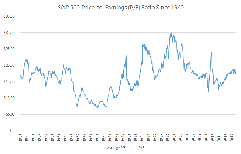
The financial media from the Wall Street Journal to CNBC and everyone in between would have us believe that the S&P 500 is dangerously overpriced.  Stocks are currently trading at a P/E ratio of nearly 19, which is 15% higher than the long-term “average” P/E ratio of 16.5.

[Cue the financial media freakout]

C’mon man (woman).  You don’t know what you’re talking about.  Using the average P/E to determine whether or not the market is fairly priced is like using a thermometer to determine how fast the wind is blowing.  A thermometer is a useful device for measuring body temperature, but useless for measuring wind speed.  As we will soon show, using the average P/E alone to value the market is also useless.

The chart below alone is enough to prove that average P/Es don’t tell you a thing.  The blue line shows the actual P/E ratio vs. the long-term average P/E shown by the orange line.

Can any useful information be derived from this chart?  Does the orange line tell you anything about the blue line?  
There are; however, a few things we can glean from the chart.  
1. Stocks Almost Never Trade at “Average P/E” Levels
With the frequency that “average P/E” is thrown out at us, you would think stocks often trade at the average P/E.  But they don’t.  In fact, stocks have traded at or near their long-term average in just 9 out of 676 months going back to 1960.  That’s 1.3% of the time.  The other 98.7% of the time, stocks did not trade at their long-term average P/E.
Can we just get the message through to the financial media: stocks almost never trade at their average P/Es.  In effect, there is no such thing as a “normal” P/E.  Please stop referencing it. It doesn’t exist.
2. Today’s P/E Ratio Isn’t Particularly High
Look at the far right of the chart showing where P/Es stand today vs. the historical average.  Does it look all that high to you?  It’s not.
The S&P 500 has traded at a P/E of 19 or higher nearly 30% of the time.  Are P/E ratios higher than they have historically been?  Yes.  But it’s not like 19 is uncharted territory.  It is still well within what we have seen before.

3. Stocks Can Still Go Up from “Elevated” P/Es

Even when the media are proclaiming that P/Es are “elevated” compared to historical averages, stocks have produced good results.  Since 1960, when stocks have traded at a P/E of 19 or more, they have produced positive price returns more than 66% of the time over the next 12 months.

Do P/E Ratios Make Any Sense?

Historical P/Es look completely random, don’t they?  Why did stocks trade at 7 times earnings in 1980 and then 30+ times earnings in 1999? Let’s see if we can find anything that would suggest why P/Es traded where they did over the last 50 odd years.  If we can, we would have an honest to goodness valuation tool.

What is the “Right” P/E?
We’ve seen that stocks almost never trade at their average P/E.  So that’s obviously not the “right” P/E.  But if not the average, then what? To determine that, we need to flip our thinking upside down. We’re going to look at what is called the “earnings yield,” which is simply the P/E ratio flipped into an E/P ratio.  If you buy a stock for $100 that generates $8 per year in earnings, you have paid 12.5 times earnings (P/E = 12.5).  Flip that upside down and you would see that your “earnings yield” is $8 divided by $100 = 8%.
The “earnings yield” is more useful when comparing stocks (and businesses) to alternative investments that are quoted in percentages.  When earnings yields on stocks are higher than bond yields - stocks are a better bargain.  When bonds are yielding more than stocks - you might be in favor of buying bonds, instead.
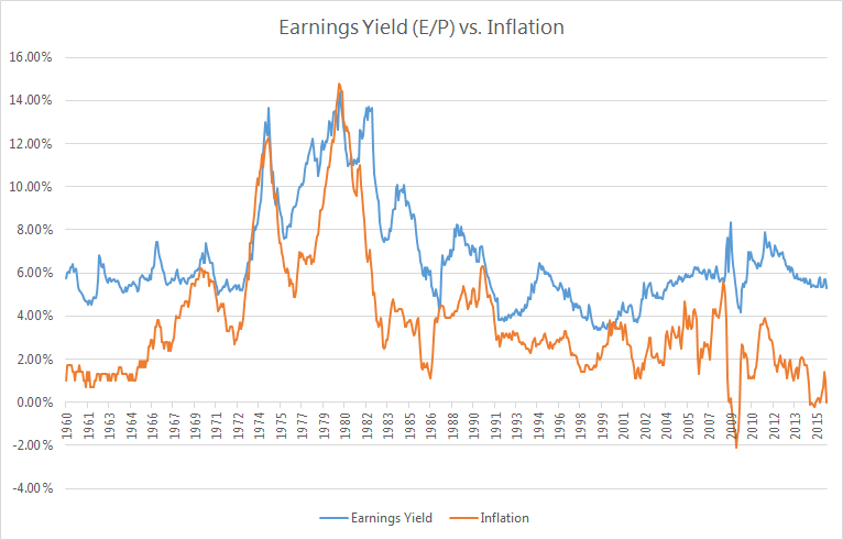
Our research shows there is a high correlation between earnings yield (P/E upside down) and inflation.  The chart below shows earnings yield as the blue line and inflation as the orange line.
There is a clear relationship between earnings yield and inflation.  When inflation goes up, the earnings yield also increases (meaning the P/E ratio goes down).  The statistical correlation between the two data series is more than 70%.
In the 1970s and 1980s, inflation was higher than we’ve ever seen it.  At one point, inflation reached nearly 15%.  At that time, the earnings yield for stocks reached nearly 15%.  If you flip a 15% earnings yield back into P/Es - we calculate 1 / 15% = 6.7.  So high inflation means high earnings yield (low P/E ratio).
The reverse is also true.  When inflation is low, earnings yields should also be low (P/E ratios high). And that is what we have seen.  In periods where inflation has been less than 3%, earnings yields have averaged approximately 5.2%.  Flipped upside down, that means the P/E in those low inflation periods was 1 / 5.2% = 19.
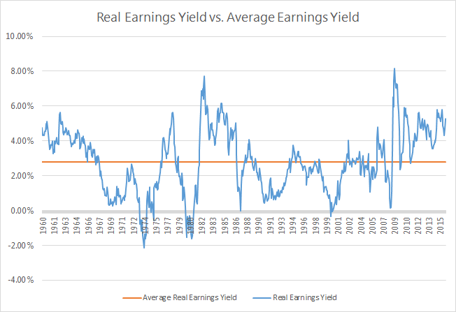
So that brings us to one last chart.  This shows the “real” earnings yield for stocks, which is simply the earnings yield (E/P) minus inflation.  According to our research, this metric is a much better indicator than the simple P/E for determining the relative value of stocks at any given point in time.
When the real earnings yield (blue line) has been below the long-term average (orange line), that has meant that stocks were overpriced relative to the then current inflation levels.  When the real earnings yield have been higher than the orange line, stocks have been a good buy.
You can see that this model correctly predicted that stocks were way overvalued in the mid-1970s, early 1980s, in 1987, during the “tech bubble” in the early 2000s, and during the Great Recession of 2008.
It also correctly indicated that stocks were a great value in the early 1980s and again in 2009.
So… Are Stocks Overpriced Today?
Today’s real earnings yield spread is 4.4%, which is significantly higher than its long-term average. If the earnings yield were to trade at it historical relationship to inflation, the appropriate real earnings yield today would be 2.8%.  When you add back current inflation of 1%, we see that the appropriate earnings yield for the S&P 500 is about 3.8%.  When you flip that upside down into P/Es, we get 1 / 3.8% = 26.3.  
Are we suggesting that P/E ratios should go to 26.3?  Not necessarily.  But we are saying that the current low-inflationary environment should result in stocks trading at higher P/E ratios than the “average P/E.”  If we were to see inflation remain at 1% for the next decade, it is entirely possible (and reasonable) that stocks could head towards a P/E of 25+.  The CNBC broadcasters are starting to sweat at the thought of it.
For those of you that are still skeptical that stocks can go higher from here, just think about this.  The current real earnings yield for the S&P 500 is 4.4%.  There have been 123 months since 1960 when stocks have traded for a higher yield than that.  With those months as a starting point, the average return over the next year was 21.5%.
So can P/E ratios expand from here?  History tells us overwhelmingly that they can.  Not only that, but the current inflationary environment says that they should.
Conclusion
Are we saying stocks are going to go up 21.5% over the next 12 months?  Maybe yes, maybe no. There is reason to believe that the current slow economic growth will likely reduce future earnings growth and, thus, impact future stock returns.  However, it should be clear that stocks are not trading at significant premiums to where they should be.  Unless earnings collapse or inflation explodes, stocks could (and probably will) continue to move higher on the back of rising P/Es.
So next time you’re out with your friends or watching some talking head on CNBC and the topic of P/E ratios being high – remember that average P/Es are meaningless as a valuation tool.  Anyone who says they should trade at 16.5x just because that has been the average doesn’t know what they are talking about. There is no such thing as a normal P/E.  

Friday, May 15, 2015

The Great P/E Debate: Are Stocks Overvalued?

Janet Yellen made headlines last week with her comment that stock market valuations “generally are quite high.”  The market took note, driving down prices.

Is she right?  Are stocks overvalued?

It certainly feels that way to most investors.  Stocks are trading at all time highs and are in the midst of a bull market that has seen the S&P 500 move up more than 200% since mid-2009 lows.

However, investing based upon feelings isn’t usually a very good idea.  That’s why we rely so much on statistical models to help us be objective about where market valuations stand at any given point in time.  Let’s see what we can uncover.

The Average P/E Says… Stocks Overvalued


It is most likely that Yellen was referring to the price-to-earnings (P/E) ratio in her speech.  Stock market pessimists have been promoting doom-and-gloom for years now.  The #1 argument they make is that the P/E ratio is higher than its long-term average.

Below is a chart showing the S&P 500’s P/E ratio going back to 1962, as represented by the red line.  The blue line is the S&P 500’s long-term average P/E of 15.  


The current P/E of 18.5 is higher than the long-term average. Taken at face value, this would indicate that stocks are frothy.  However, this argument has several critical flaws.

1. Stocks seldom trade at average P/Es.
  

Since 1962, the S&P 500 spent virtually no time at its long-term average of 15. In many years, it traded at a P/E far from its long-term average.

2. A “fair” P/E ratio is impossible to determine in isolation.
What is a “fair” P/E ratio?  Is 15 fair?  If so, what makes it fair?  The point is that P/E ratios mean little in isolation. There are other factors that we must consider to get the entire picture.
   

The Missing Link: Inflation


What is the most important factor in determining fair P/E ratios?  We have looked at correlations between P/E ratios and all kinds of variables.  We do not find strong relationships between any of the widely followed indicators such as interest rates, GDP growth or earnings growth.  We have found that inflation is the best predictor of P/E ratios at any given point in time.

To make this more intuitive, we’ve converted the P/E ratio into E/P, which is known as the “earnings yield”.  In other words, if the S&P 500 paid out 100% of its earnings as a dividend, what would the yield be?

The chart below compares the S&P 500 earnings yield and the personal consumption deflator, which is what the Fed uses as its inflation measure.


As you can see, there is a clear visual relationship between the two.  To measure the relationship mathematically, we created the scattergram shown below.  On the left axis is earnings yield and the bottom axis is inflation. Drawn through the middle is a linear regression line.


The correlation between inflation and earnings yield is not perfect, but it is there.  Using this regression, we arrive at the formula shown in the bottom right corner.  That formula is:


y = 0.9048x + 0.0366

In the above formula, “y” represents the estimated earnings yield and “x” represents the current inflation level.  If we plug in today’s level of inflation, the formula will predict where today’s earnings yield should be based on the historical relationship between inflation and earnings yield over the past 212 quarters.

In the chart below, we’ve applied this formula to each quarter going back to 1962.  The blue line represents the “predicted” earnings yield and the red line represents what the actual earnings yield was.


Most people aren’t used to looking at charts of earnings yield, so we converted the earnings yield (E/P) back into P/E.  That chart is shown below.


The chart above clearly has more predictive power than the “average” P/E.  If you were simply following this chart, you would have predicted that stocks were about fairly valued in most periods except the following:

  • Overvalued from 1968 to 1973
  • Undervalued in 1985
  • Overvalued in 1987 (right before the market crashed by 25%)
  • Significantly overvalued from 1992 through 1994
  • Significantly overvalued from 1998 through 2001
  • Undervalued from 2009 through today

What does this mean for today’s market?


This model tells us a few things:

1. Stocks are not overvalued.

Far from it.  According to this model, the appropriate earnings yield is roughly 4.7%, which translates to a P/E just over 21. If the personal consumption deflator were to hold around 1.1%, the market would likely continue P/E expansion.

2. The stock market can handle some inflation.

The Fed has stated that their target inflation level is 2% vs. today’s 1.1%.  If inflation does rise to 2%, our formula estimates that the fair P/E would be about 18.5, which is exactly where we are now.  The stock market appears to be pricing in the expectation that inflation will rise.

3. The Fed isn’t going to wreck the stock market.

Investors across the globe are concerned that stocks will be hurt when the Fed starts to raise rates.  According to our research, however, this just isn’t the case.  Inflation is twice as correlated with P/Es as interest rates.  In our judgement, a gradually rising Fed funds rate won’t bring down the market. As long as the Fed does not aggressively raise rates, signalling that they see a significant risk to higher inflation, stocks can handle a period of rising interest rates.

The Great P/E debate will surely rage on for decades to come, but we believe many investors - including our own Fed chairwoman - have completely missed the point.  Average P/Es have no predictive ability for future P/Es without taking inflation into consideration.   

Unless inflation rises above 2%, the S&P 500 will be driven primarily by the future growth of earnings and dividends.  In this regard, there is plenty of good news.  Wall Street analysts are currently projecting double-digit growth in both earnings and dividends over the next 12 months. 

If Fed chair Janet Yellen jawbones inflation worries higher, that could derail stocks.  If she focuses her attention on containing inflation rather than forecasting stock market valuations, we would all be better served.

Thursday, February 27, 2014

How Dividend Payout Ratios Impact Valuation

   One of the greatest misconceptions among investors is that valuing the market at any given time is impossible. Many people seem to believe the stock market is nothing more than a betting parlour where today's price or tomorrow's price is whatever the fickled gods of Wall Street decree it to be.

Part of this misconception comes from the many voices in the media that are at the extremes in their predictions of where the market is going. On one side, the “stock market bubble” pessimists (who have been saying the same things for the past 5 years) are predicting that the market is overvalued 25% or more. On the other hand, many in the bullish crowd are saying the market is as much as 25% undervalued.

Whom are investors to believe?