Showing posts with label P/E ratio. Show all posts

Tuesday, January 07, 2025

Caution: We Are Entering A "Prove It" Market


  • In my recently released book, The HIdden Power of Rising Dividends,(available at Amazon) I make the case that dividend growth is highly correlated with price growth for many stocks and indices.
  • In the book, I suggest that dividend growth alone is highly correlated with price growth for 25-35% of S&P 500 stocks. For an additional 50% of stocks, dividend growth is the most important indicator of value, but the correlation scores rise when we add some portion of sales and earnings growth, along with changes in interest rates.
  • The consensus view of many stock market prognosticators today is that stocks, now trading at 27 time operating earnings, are extremely overpriced and are due for a big correction.
  • My S&P 500 valuation model is telling a much more balanced story:


  • The above chart is what I call a Value Bar chart. The green bars show my model's annual predicted price of the S&P 500 going back to 2005. A quick look at the bar farthest to the right on the chart shows the model's current predicted price of the S&P 500. That figure is approximately 5,400. With the current price of the S&P 500 at around 6,000, the model is saying stocks are overvalued by about 10%. That, however, is before we factor in 2024 year end earnings and 2025 forward earnings.
  •  Before we take a deeper look at the current predicted price, let's look back over the years to see how the model has fared.
  • Simply speaking, if the red line (actual price) is above its corresponding Value Bar, we would say stocks are overvalued. If the the red line is lower that the Value Bar for the same year, we would say stocks are undervalued. For the last 20 years, the red line has stayed very close to the top of the Value Bars. A significant divergence is evident in only 2007, 2008,and 2022. In almost all other years, the Value Bars and actual prices of the S&P 500 are very close.
  • Stocks continued to climb heading into the beginning of the Great Recession in 2007. At some point during the year, the model would have issued an overvalued signal. The model clearly signaled the market was overvalued in 2008.
  • After the bear market of 2008 and 2009, the Value Bars stayed in fairly-valued or undervalued territory until the end of 2021, when they gave an overvalued reading. That signal correctly foresaw the selloff in 2022.
  • That brings us to the current modest overvaluation. Plugging in Wall Street's current estimates of sales, earnings, dividends, and interest rates give us a figure of 6,500. 
  • We are now entering what I call a "Prove It" market. This means, tech stocks, where the majority of the growth is coming from, must "Prove It" that they can continue with mid 20% sales and earnings growth. If they do, we should have another pretty good year. If not . . . .
  •          
If any of you would like to discuss this article privately, please email me at info@gregdonaldson.com.


Friday, May 11, 2018

The Great P/E Debate: A Stopped Clock and Other Wild Eyed Guesses

We have shown in previous blogs that much of what academia and Wall Street tell us about how to calculate the most foolproof price-to-earnings ratio for the S&P 500 at any point in time is . . .well, foolish.

1. Professor Robert Shiller, the creator of the CAPE method of valuing stocks, which has many academic adherents, says that stocks are wildly overvalued.  The only problem is he has been saying that for nearly six years, and in interviews, he cautions that CAPE is not a good metric for timing.  But, professor, what good is a valuation metric if it is correct only once every decade, or so?  That sounds a bit like the accuracy of a dead clock: it's correct twice a day but fails at telling time during the other 23 hours 59 minutes and 58 seconds of the day.  CAPE currently suggests that the S&P 500 P/E is approximately 80% above it fair value.  

2. There is another crowd of soothsayers who hold to the idea that the long-term average P/E of the S&P 500 is the correct metric to determine its fair value.  These folks argue that a P/E of 16x is the right multiplier, and, that being the case, at 21.3x, stocks are currently about 33% overvalued.  History shows us that if you would have bought every year when the S&P 500 was below a 16x P/E and sold or shorted every year above that level you would have crashed and burned a long time ago.

3. Many on Wall Street believe that the best way to calculate the normal P/E for the S&P 500 is to subtract the rate of inflation from 20.  In our judgement, this crowd has had a better track record over the last 50 years than Dr. Shiller or the 16x crowd, but we have previously shown, there is a more statistically significant way to determine the right P/E at any point in time.  That methodology is what we call the earnings yield to inflation' ratio.  

Our work shows that since the 1960s, earnings yield (the inverse of P/E) minus core inflation has averaged 3.35% with a correlation coefficient of .70.  For our calculations, we use earnings before extraordinary additions or subtractions and the core personal consumption deflator inflation (PCD, the data most favored by the Fed.)  The current reading for these two data points are as follows.  PCD is 1.6% and the trailing 12 month earnings yield is 4.70%, or a P/E of 21.3.  

To determine where the model says the current earnings yield, (P/E) ought to be, we add the current PCD rate of 1.6% to the long-term constant of 3.35%, or 4.95%. Converting this back to P/E, we find the model predicts the correct P/E is now 20.2x.  With the S&P 500 now trading at 21.3 times earnings, that would suggest that stocks might be about five percent overvalued.  But there's more.  The stock market is a discounting mechanism.  That is, it is always looking ahead and pricing in where it believes current financial and economic data will be in the future.  Currently the consensus view of analysts and economists is that the PCD inflation rate will climb to 2% by year end and S&P 500 earnings will grow to approximately 160.  If these estimates come to pass, that would put the fair value of the S&P 500 at about 3200 by year end.  

With the S&P 500 currently sitting at 2727, that would mean it is about 17% undervalued.  That's my best guess and I'm sticking with it no matter how much volatility we see over the next few months. I'll update the model in the coming months. 

Earlier, I said the correlation coefficient on our P/E model is approximately .70.  Being less than 1.00 means that it has not perfectly predicted annual stock market moves (surprise, surprise).  I offer it here because the model is simple and has done a reasonably good job of predicting stock market action over the last few years.  We have another model that has more complexity and with an even higher correlation coefficient that also predicts stocks are undervalued by double digits.  I'll show it in a future blog.
  

Monday, October 30, 2017

The Great P/E Debate: The End Is Not Near, Stocks Are Going Higher

The cacophony of “the end is near” cries from the doom and gloomers is much with us as stocks have marched unrelentingly higher over the last few years.  The doom and gloomers do a lot of talking and shouting, but they don’t seem to do much actual research.  For if they did, they would have discovered a relationship between earnings yields (the inverse of P/E) and inflation that suggests that at a P/E of 21.7x stocks are selling just about where they should be.

The picture below is a screenshot from my Bloomberg terminal showing the historical spreads of the S&P 500’s earnings yield and the personal consumption deflator, the measure of inflation that the Federal Reserve says is most accurate.  Earnings yield, which I define as S&P 500 operating earnings divided by price, or the inverse of P/E, is quoted as a percentage, as is inflation. This produces a visual representation between the two data series that is easy to analyze.

I have written about this relationship as the most important driver of the S&P 500 and Dow Jones 30 price-to-earnings ratios for many years.  I first discovered the relationship between earnings yield and inflation in the 1990s via some data that Value-Line provided their subscribers.  I was surprised that of all the data that I studied, inflation was the most highly correlated with earnings yield.  I would have bet almost anything that interest rates would have proven to have had the best correlation. (I will show the current picture of earnings yield and interest rates later.).   
 
In the upper left-hand side of the picture, you can see the movements of inflation versus earnings yield charted on a quarterly basis going back to 1973.  The difference between the two data series is shown in green.  During this time, you will note that the two lines have moved almost on a tit for tat basis and now stand at about 4.6% for earnings yield and 1.4% for inflation.  The data box at the top right of the picture shows that the average difference between earnings yield and inflation during this 43- year period has been about 3.4%.  Right above that data-point is the current difference of about 3.3%.  There is a lot of other data on this picture, but let me direct your attention to two other important indicators.  I have drawn a red arrow (lower right) pointing at R^2 (Correlation).  You can see that the R^2 between the two data series is very high at .705.  R^2 is a statistical measure of fit between two or more data series and calculates that quarterly movements in inflation have been able to predict just over 70% of the movements of earnings yield and thus P/E.  At our firm, we have more complex models using a wide range of other data series that can raise the R^2 up as high as 95%.

The second important indicator to consider is contained in the red circle I have drawn around a faint red asterisk on the lower left-hand side of the picture.  The red asterisk shows the current differential between earnings yield and inflation, and it is sitting just about where we would hope it would be -- on the fair value line.

In summary, trading at 21.7 times operating earnings, stocks are not wildly overvalued, using inflation as the measure of value, and there is no other single data series that I know of that is able to pinpoint P/E with such statistical accuracy.  I think the doom and gloomers are howling in the wind and their doom and gloom will continue to build as stocks go higher. In my judgement, if the current earnings growth continues, inflation would have to rise nearly one percent to roughly 2.5% before stocks would begin to feel headwinds.

Below I have copied a picture of the relationship between earnings yield and interest rates.  You will note the fit between the two data series is much less convincing than that of earnings yield and inflation.  Indeed, the two data series flip flopped positions in the late 1970s and thus have an R^2 of only about .42.

Wednesday, April 27, 2016

C’mon, Man: There Is No Such Thing as a “Normal” P/E

And now for the most exaggerated, overblown, annoying, and ignorant claim in the financial media today: “The stock market is dramatically overvalued and headed for a fall.”
The financial media from the Wall Street Journal to CNBC and everyone in between would have us believe that the S&P 500 is dangerously overpriced.  Stocks are currently trading at a P/E ratio of nearly 19, which is 15% higher than the long-term “average” P/E ratio of 16.5.

[Cue the financial media freakout]

C’mon man (woman).  You don’t know what you’re talking about.  Using the average P/E to determine whether or not the market is fairly priced is like using a thermometer to determine how fast the wind is blowing.  A thermometer is a useful device for measuring body temperature, but useless for measuring wind speed.  As we will soon show, using the average P/E alone to value the market is also useless.

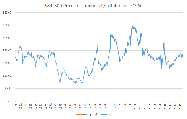
The chart below alone is enough to prove that average P/Es don’t tell you a thing.  The blue line shows the actual P/E ratio vs. the long-term average P/E shown by the orange line.

Can any useful information be derived from this chart?  Does the orange line tell you anything about the blue line?  
There are; however, a few things we can glean from the chart.  
1. Stocks Almost Never Trade at “Average P/E” Levels
With the frequency that “average P/E” is thrown out at us, you would think stocks often trade at the average P/E.  But they don’t.  In fact, stocks have traded at or near their long-term average in just 9 out of 676 months going back to 1960.  That’s 1.3% of the time.  The other 98.7% of the time, stocks did not trade at their long-term average P/E.
Can we just get the message through to the financial media: stocks almost never trade at their average P/Es.  In effect, there is no such thing as a “normal” P/E.  Please stop referencing it. It doesn’t exist.
2. Today’s P/E Ratio Isn’t Particularly High
Look at the far right of the chart showing where P/Es stand today vs. the historical average.  Does it look all that high to you?  It’s not.
The S&P 500 has traded at a P/E of 19 or higher nearly 30% of the time.  Are P/E ratios higher than they have historically been?  Yes.  But it’s not like 19 is uncharted territory.  It is still well within what we have seen before.

3. Stocks Can Still Go Up from “Elevated” P/Es

Even when the media are proclaiming that P/Es are “elevated” compared to historical averages, stocks have produced good results.  Since 1960, when stocks have traded at a P/E of 19 or more, they have produced positive price returns more than 66% of the time over the next 12 months.

Do P/E Ratios Make Any Sense?

Historical P/Es look completely random, don’t they?  Why did stocks trade at 7 times earnings in 1980 and then 30+ times earnings in 1999? Let’s see if we can find anything that would suggest why P/Es traded where they did over the last 50 odd years.  If we can, we would have an honest to goodness valuation tool.

What is the “Right” P/E?
We’ve seen that stocks almost never trade at their average P/E.  So that’s obviously not the “right” P/E.  But if not the average, then what? To determine that, we need to flip our thinking upside down. We’re going to look at what is called the “earnings yield,” which is simply the P/E ratio flipped into an E/P ratio.  If you buy a stock for $100 that generates $8 per year in earnings, you have paid 12.5 times earnings (P/E = 12.5).  Flip that upside down and you would see that your “earnings yield” is $8 divided by $100 = 8%.
The “earnings yield” is more useful when comparing stocks (and businesses) to alternative investments that are quoted in percentages.  When earnings yields on stocks are higher than bond yields - stocks are a better bargain.  When bonds are yielding more than stocks - you might be in favor of buying bonds, instead.
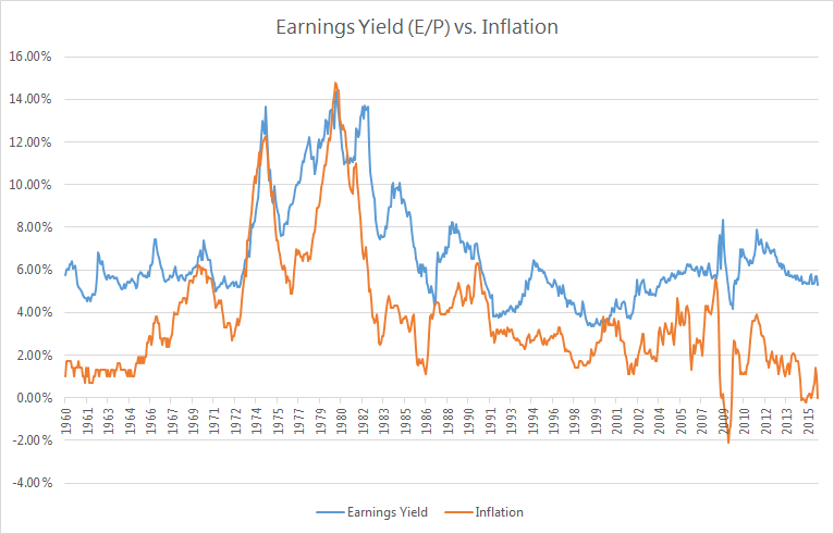
Our research shows there is a high correlation between earnings yield (P/E upside down) and inflation.  The chart below shows earnings yield as the blue line and inflation as the orange line.
There is a clear relationship between earnings yield and inflation.  When inflation goes up, the earnings yield also increases (meaning the P/E ratio goes down).  The statistical correlation between the two data series is more than 70%.
In the 1970s and 1980s, inflation was higher than we’ve ever seen it.  At one point, inflation reached nearly 15%.  At that time, the earnings yield for stocks reached nearly 15%.  If you flip a 15% earnings yield back into P/Es - we calculate 1 / 15% = 6.7.  So high inflation means high earnings yield (low P/E ratio).
The reverse is also true.  When inflation is low, earnings yields should also be low (P/E ratios high). And that is what we have seen.  In periods where inflation has been less than 3%, earnings yields have averaged approximately 5.2%.  Flipped upside down, that means the P/E in those low inflation periods was 1 / 5.2% = 19.
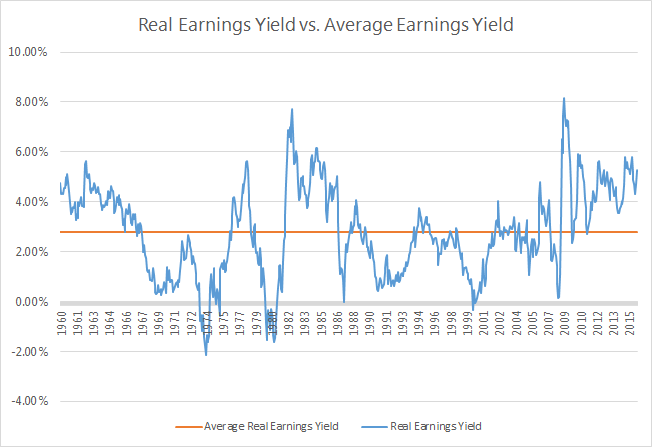
So that brings us to one last chart.  This shows the “real” earnings yield for stocks, which is simply the earnings yield (E/P) minus inflation.  According to our research, this metric is a much better indicator than the simple P/E for determining the relative value of stocks at any given point in time.
When the real earnings yield (blue line) has been below the long-term average (orange line), that has meant that stocks were overpriced relative to the then current inflation levels.  When the real earnings yield have been higher than the orange line, stocks have been a good buy.
You can see that this model correctly predicted that stocks were way overvalued in the mid-1970s, early 1980s, in 1987, during the “tech bubble” in the early 2000s, and during the Great Recession of 2008.
It also correctly indicated that stocks were a great value in the early 1980s and again in 2009.
So… Are Stocks Overpriced Today?
Today’s real earnings yield spread is 4.4%, which is significantly higher than its long-term average. If the earnings yield were to trade at it historical relationship to inflation, the appropriate real earnings yield today would be 2.8%.  When you add back current inflation of 1%, we see that the appropriate earnings yield for the S&P 500 is about 3.8%.  When you flip that upside down into P/Es, we get 1 / 3.8% = 26.3.  
Are we suggesting that P/E ratios should go to 26.3?  Not necessarily.  But we are saying that the current low-inflationary environment should result in stocks trading at higher P/E ratios than the “average P/E.”  If we were to see inflation remain at 1% for the next decade, it is entirely possible (and reasonable) that stocks could head towards a P/E of 25+.  The CNBC broadcasters are starting to sweat at the thought of it.
For those of you that are still skeptical that stocks can go higher from here, just think about this.  The current real earnings yield for the S&P 500 is 4.4%.  There have been 123 months since 1960 when stocks have traded for a higher yield than that.  With those months as a starting point, the average return over the next year was 21.5%.
So can P/E ratios expand from here?  History tells us overwhelmingly that they can.  Not only that, but the current inflationary environment says that they should.
Conclusion
Are we saying stocks are going to go up 21.5% over the next 12 months?  Maybe yes, maybe no. There is reason to believe that the current slow economic growth will likely reduce future earnings growth and, thus, impact future stock returns.  However, it should be clear that stocks are not trading at significant premiums to where they should be.  Unless earnings collapse or inflation explodes, stocks could (and probably will) continue to move higher on the back of rising P/Es.
So next time you’re out with your friends or watching some talking head on CNBC and the topic of P/E ratios being high – remember that average P/Es are meaningless as a valuation tool.  Anyone who says they should trade at 16.5x just because that has been the average doesn’t know what they are talking about. There is no such thing as a normal P/E.  

Wednesday, April 01, 2015

Why Are Stocks So Volatile?

Stock market volatility has increased dramatically over the last six months. Many commentators are saying the increased volatility is a negative sign for stock performance through the remainder of the year and perhaps beyond.  As usual they might be right, and they might be wrong.  Before we give you our view, let’s look at what we believe are the three main drivers of the increased volatility and see how they are trending.

1. Uncertainty about the timing of the Fed rate hike
2. Earnings worries
3. Valuation concerns


The Fed: Don’t fight the Fed, don’t fight the Fed, don’t fight the Fed.  As any seasoned investor knows, these are the first three rules of investing.  The Fed has incredible power to impose its will on the markets.  Back in the days prior to the Tech wreck, commentators were saying that the Fed’s power to rein in the technology stocks was dramatically reduced because most of these companies used very little debt.  The Fed raised its Fed Funds rate seven times before Tech stocks crumbled, but crumble they did.  Again in 2009, the chorus of naysayers was deafening in its assertion that the subprime crisis was too big for the Fed.  Today the S&P 500 is approximately 300% higher than its low in March of 2009.  In our judgement, the Fed can do what it wants.  So the single most important question facing investors is, “What does the Fed want?”


We believe the Fed has no intentions of causing a big sell off in stocks. Indeed, Quantitative Easing was all about pushing investors out of riskless securities and into riskier assets, including stocks.  Why would the Fed have moved heaven and earth over the last six years to avoid a deflationary mindset from setting in with banks and investors, to toss it all away and send stocks into a tailspin?  That is an absolute recipe for recession, and they know it.   


The Fed wants to keep a lid on inflation and stimulate job growth, yet it also wants to avoid both another 1995-1999 stock market melt-up and a 2000-2002 meltdown.  Our Macro Team believes that the lessons of the 1990s are still very much alive in the minds of the Fed.  To accomplish their purposes, they are likely to do a lot of talking but very little acting.  We believe Fed Chair Janet Yellen said as much in her speech last Friday.  The uncertainty about what the Fed will do is not going away, yet we believe the odds of the Fed slamming on the brakes are extremely low.  They will increase rates modestly at some point, but we do not forecast a long string of hikes that would freeze the markets or cause a big sell off.


Earnings: Earnings growth for the S&P 500 over the last 12 months has been a paltry 4.3%.  During this same time, stock prices have risen nearly 13%.  At the beginning of 2014, we said that stocks were about fairly valued, so the returns for the year would likely be about the same as earnings and dividend growth.  A 13% price return on earnings growth of about one-third of that is front and center in the minds of every investment firm we know of.  The market has given the weak earnings a pass so far because of two unusual events:

1. The dollar has risen by as much as 20% versus the currencies of other developed countries.  Since S&P 500 companies generate nearly 50% of their revenues outside the U.S, they have had to absorb currency losses for the last four quarters.  These currency translation losses have significantly reduced reported earnings.  This trend cannot continue indefinitely.

2. The entire Energy sector took a huge earnings hit in the fourth quarter of 2014 and will again in the first quarter of 2015.   Since the Energy sector represents nearly 10% of the S&P 500, it has also produced a drag on corporate earnings.  Once oil prices reach a bottom, this too will cease to be a headwind.


The good news here, which gets almost no attention in the media, is that S&P 500 dividends increased by over 13% during the last 12 months.  We consider that an important signal that corporate America believes the two headwinds hurting earnings are temporary.


Valuation:  If prices rose in 2014 by 13% and earnings grew by only 4.3%, then the price-to-earnings (P/E) multiple expanded.  Indeed, the P/E multiple now stands at nearly 18 times earnings, which is the highest level since 2007. Stocks are not cheap from a P/E perspective, which worries a lot of investors. We have modeled P/Es going back to the 1920s and we find there is no such thing as a “normal” P/E ratio.  


Our research shows that P/Es are inversely correlated with inflation.  In high inflation periods, P/E ratios have almost always been low and high in low inflation eras.  Think of it this way:  If we divide earnings by price, we produce something called Earnings Yield.  Earnings Yield is stated as a percentage.  It is essentially a computation that shows how much a company’s earnings produce as a percentage of it price.  This percentage can then be compared to bonds, inflation, or other stocks to determine how good of a deal you are getting.  This is how an investor like Warren Buffett determines if Heinz or Kraft is a good deal.


As we said before, the S&P 500 is currently selling for about 18 times earnings.  To convert this into an Earnings Yield, we divide 18 into 1 to see that the current level is 5.5%.  That means if Warren Buffet was interested in buying the whole S&P 500, he would earn a 5.5% total annual return based on the current earnings.  5.5% does not seem like a great return, but there are two important considerations.

1. How does that return compare to my other alternatives?


While 5.5% may not seem like much, it is terrific when compared to a short list of alternatives.  A five-year U.S. Treasury bond yields 1.3%, and a ten-year U.S. Treasury bond yields about 1.9%.  Thus, not counting any earnings growth that we may receive in the future, stocks would seem to be a good deal with an earnings yield much higher than bond yields.  


As we said earlier, our work has shown that Earnings Yields or P/Es are most highly correlated with inflation.  Today, the inflation figure that the Fed uses, the Personal Consumption Expenditure Deflator (PCE) stands at 1.1%.  We have found that the spread between Earnings Yield and the PCD over the last 50 years has averaged 3.4%.  By adding the current level of inflation of 1.1% to the average spread of 3.4%, we find that the model would suggest that the right level of Earnings Yield for today’s inflation level is 4.4%.  


So we can get back to how we normally talk about earnings and prices, let’s re-convert the predicted 4.4% Earnings Yield back to a P/E ratio.  A 4.4% Earnings Yield would equate to a P/E ratio of 22.7.  With stocks currently selling at 18 times earnings, our P/E finder model would say they are  cheap.

2. Is that return all we are likely to get?


The current earnings yield of 5.5% does not factor in any future earnings growth.  If the long-term growth of earnings approximates nominal GDP growth of 5% or 6%, the effective earnings yield for today’s investor would double once every 12-14 years.


In addition to P/E, we have another way of looking at market valuations.  As we have discussed over the years, we have a S&P 500 valuation model.  This is a statistical model that calculates the relationship between various factors including dividends, earnings, inflation, and interest rates.  According to that model, we are currently selling about 7% under where year-end 2015 data for the variables are now predicted to be.


Bottom Line


Uncertainties about many different factors have caused stocks to become more volatile.  We believe we will know a lot more about Fed actions and the outlook for future earnings beginning in August once the impact of big changes in currencies and oil prices are better understood.  Furthermore, valuation is not a problem according to both our P/E finder model and statistical S&P 500 model.  

The current market’s volatility will ultimately pass.  Based upon what we see, the path of least resistance for stocks is still up.  However, it will take a few more months before many of investor concerns will subside.  The best course for investors is to ignore market volatility and remain committed to building a stream of growing dividend income.     

Tuesday, October 07, 2014

The 4 Drivers of Stock Market Prices

We have found that very few investors understand what really drives the stock market.  In our view, the four primary drivers of market valuations are earnings, dividends, interest rates and inflation.  If you can quantify what is going on with those four variables, our models indicate that you can predict about 90% of the annual movement of stock prices.
Last time, we talked about the Barnyard Forecast which is a model that signals the probable direction of the market.  While the Barnyard Forecast does correctly predict the market’s direction 6 to 18 months from now with about 80% accuracy, it is not a short-term predictor nor does it have any valuation component.  Therefore, we use select valuation models to ascertain the relative attractiveness of stocks.

Almost all of these models use some component of the above mentioned variables.  Within those four variables, there are two that stand out above the others as being the most important drivers.  We’ll take a look at each factor and then conclude with what it means for stocks.

Earnings

Most investors look to earnings as the primary guide of what a company is worth.  In theory, that makes sense.  If Company A is earning $500 and Company B is earning $1,000 - wouldn’t you rather own Company B?
The problem with earnings is that they can be engineered by creative corporate executives.  In times of recession, earnings are particularly volatile. Earnings can be calculated in a variety of different ways, which adds additional complexity.  We don’t think earnings should be completely discounted in valuing companies or the stock market as a whole.  However, the unpredictable nature of earnings often gives very bad signals at turning points in the market.
Dividends

We have found dividends to work much better than earnings.  Over the past 50+ years, dividends have had approximately three times more predictive power than earnings.
Let’s say you own two rental properties.  One rents for $100 per month and the other rents for $200.  If both rents are increasing at 3% per year and both will continue to rent for the next 20 years, which rental property would be worth more to you?  The one that will pay you the most in rental income over its useful life… right?  
John Burr Williams was the first to apply this theory to stocks.  He said the value of a stock today is the sum of all future dividend payments discounted back at some required rate of return.  In other words, the more a company pays out to its owners in the future, the more valuable that company is to its owners today.  
Not only does that theory make “real world” sense, but it also holds up statistically.  In our models, we’ve found that dividends are the most important driver of stock prices by a wide margin.
Interest Rates
Interest rates are a primary concern for most stock investors.  The general level of interest rates essentially represents the “opportunity cost” of investing in stocks.
If your bank account were to start offering 10% per year on your savings account, you would probably prefer to “invest” in your savings account rather than in the stock market.  If your bank account is only paying 0.1%, however, the attractiveness of investing in stocks increases.
Many investors would be surprised, however, that interest rates are not the most important factor in determining long-term stock prices.  
Inflation
Inflation is actually a much more significant predictor.  How can that be? There are several reasons for this.
Interest rates can be artificially set by the Federal Reserve.  Inflation can be influenced by Fed policy, however, it is primarily a result of real world economic activity.

Inflation is also one of the primary drivers of interest rates.  If inflation is rising, it has the effect of diminishing the real rate of return for a bond investor.  In that environment, a bond buyer will demand a higher rate of interest to compensate for the loss of purchasing power.

In addition, inflation is impacted to a large degree by economic growth. When the economy is growing at a faster rate, the Federal Reserve will generally tighten monetary policy, which raises interest rates.
The importance of inflation is also reflected in several of our models.  We have a price-to-earnings (or “P/E”) Finder model that we use to determine the appropriate P/E ratio for stocks.  In that model, inflation has been a much better predictor of P/E than interest rates, GDP growth or earnings growth expectations.
Outlook for Stocks
If you can understand these four variables, you can get a fairly accurate gauge of the valuation of the market.  At this moment, all of these variables are very positive for stocks.
  • Dividend growth for the S&P 500 has been over 10% year-to-date.  We believe this will continue to be strong in 2015.  Companies are beginning to understand how valuable their dividend checks are to shareholders and have begun to emphasize dividend growth as a priority.

  • Earnings are expected to grow by over 10% in 2015.  Time will tell whether that will come true or not.  If it does, we anticipate the market will reward the companies for their continued strong performance.
  • Inflation remains very low.  With little capacity pressure from either employment or plant and equipment, we don’t see much of a chance that inflation gets higher than the Fed’s target of 2.5%.  The economy is simply not growing fast enough.
  • With inflation low and the Fed continuing their stimulative monetary policy, interest rates are likely to remain low.  The 10-year Treasury continues to trade at the low end of our 2013 prediction of between 2.5% and 3.0%.  We don’t anticipate that rates will get much higher than that over the near term.
As we talked about last week in our Barnyard Forecast, monetary policy conditions are very favorable.  Aside from a major geopolitical shock, stocks don’t face any major red flags going into 2015.

The most current reading from our S&P 500 valuation model indicates that the fair value of the market is about 1,950.  As this is being written, the S&P 500 is trading at about 1,952.  From both a directional perspective and a valuation perspective, our models are saying that stocks are still the place to be.

Tuesday, February 11, 2014

ABCs of Dividend Investing: How to Navigate the Current Sell-off

Since the beginning of the year, stocks have fallen by about 5%.  The modest pullback has many investors wondering whether a full out “correction” (drop in prices by 10% or more) is on its way.  

When the inevitable fluctuations in stock prices come, investors are all left with the same question: What should I do with my portfolio?

At Donaldson Capital Management, we have a particular strategy for handling market upswings and downswings.

What Is An ABC Portfolio?

As many of you are familiar, we invest only in dividend-paying stocks but we break down our portfolios into three types of dividend-paying stocks.  For those of you who are not familiar, we structure our portfolio into A, B and C stocks.  

Below is a summary of each sub-portfolio and it’s specific characteristics.  You can read about each sub-portfolio in more detail here.


Our primary investment model (“Rising Dividend-Cornerstone”) is comprised of all three types of dividend stocks.  

Regardless of what type of market we are in, a portfolio of A, B and C dividend stocks will have at least one group that performs better-than-expected.  This type of portfolio significantly outperforms